


In today’s fast-paced digital world, having a website that looks great on all devices is essential. With more and more people accessing the internet on mobile devices, it’s important to have a website that is optimized for all screen sizes. That’s where responsive design comes in. In this blog post, we’ll explore the importance of responsive design for your website and why it matters in 2023.
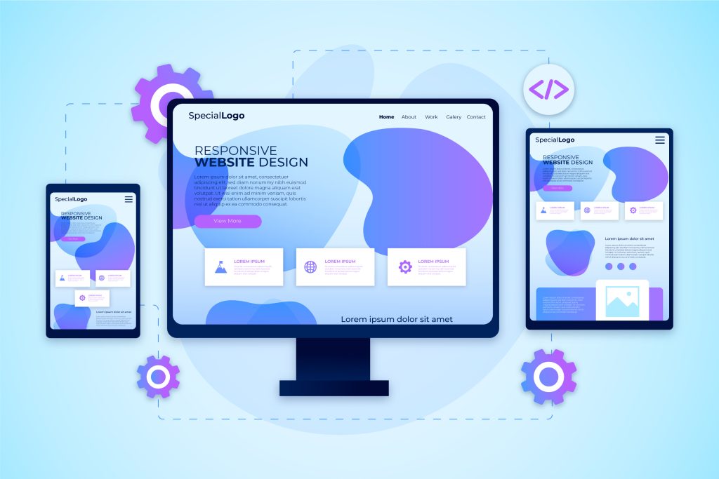
What is Responsive Design?
Responsive design is a design approach that ensures your website looks great on all devices, from desktops to tablets to smartphones. With responsive design, your website adapts to the screen size of the device being used, ensuring that users have a seamless experience, no matter what device they’re using.
Why is Responsive Design Important?
- Better User Experience: A responsive website provides a better user experience, making it easier for users to navigate and find the information they’re looking for. With a responsive design, your website is optimized for all devices, which means users can access your site from anywhere, at any time.
- Improved SEO: Responsive design can also improve your website’s search engine rankings. Google considers mobile-friendliness as a ranking factor, which means that websites that are optimized for mobile devices are more likely to appear at the top of search engine results pages.
- Increased Conversion Rates: A responsive website can also lead to increased conversion rates. With a website that’s optimized for all devices, users are more likely to stay on your site longer, which can lead to more sales, leads, and inquiries.
Statistics that Prove the Importance of Responsive Design:
- Mobile devices generated 54.8% of global web traffic in Q1 2021, a figure that is forecast to keep growing.
- 50% of smartphone users are more likely to use a company or brand’s mobile site when browsing or shopping on a smartphone because they don’t want to download an app.
- In a study commissioned by Google and conducted by 55 and Deloitte, decreasing mobile site load times by just one tenth of a second resulted in major increases in conversion rates — specifically, 8.4% for retail sites and 10.1% for travel sites.
- 73.1% of web designers believe that a non-responsive design is a top reason why visitors leave a website.
- In 2021, 53.9% of all retail ecommerce is expected to be generated via mobile devices.
- 70% longer user sessions are earned from websites that load in five seconds.
- 53% of users will abandon a page if it takes more than three seconds to load.

How to Implement Responsive Design on Your Website
Implementing responsive design on your website requires careful planning and execution. Here are some tips to get started:
- Choose a Responsive Design Theme: If you’re using a website builder or content management system, choose a responsive design theme that’s optimized for all devices.
- Prioritize Your Content: Prioritize your content so that the most important information is at the top of the page. This ensures that users can quickly find the information they need, no matter what device they’re using.
- Test Your Website: Make sure to test your website on multiple devices to ensure that it’s optimized for all screen sizes.
Conclusion
In 2023, having a website that’s optimized for all devices is essential. With more and more people accessing the internet on mobile devices, responsive design is no longer an option, it’s a necessity. With a responsive website, you can provide a better user experience, improve your search engine rankings, and increase your conversion rates. At Jigsaw Ensemble, we’re experts in responsive design and can help you create a website that’s optimized for all devices. Contact us today to learn more about our web design services.
Leave A Comment